ROLES: LEAD PRODUCT DESIGNER
The Quest to Make a Legacy Giant Feel Like a Neo-Bank.
I was the Lead Product Designer tasked with turning a "hit it and quit it" utility app into a full-blown financial destination. I led the design strategy, translated "banking legal mumbo jumbo" into a human-friendly experience, and made sure our new wallet didn't just exist, it vibed.The biggest hurdle? The Trust Paradox. People have trusted MoneyGram to move their money for 80+ years, but asking them to store it there? That’s a whole different level of intimacy. Users viewed us like a digital post office; you drop the package, and it goes away.
The Big Question
How do we convince a global audience that "keeping the cash under our digital mattress" is safer, cheaper, and smarter than their current routine? Especially when the current routine has worked for years.The Problem:
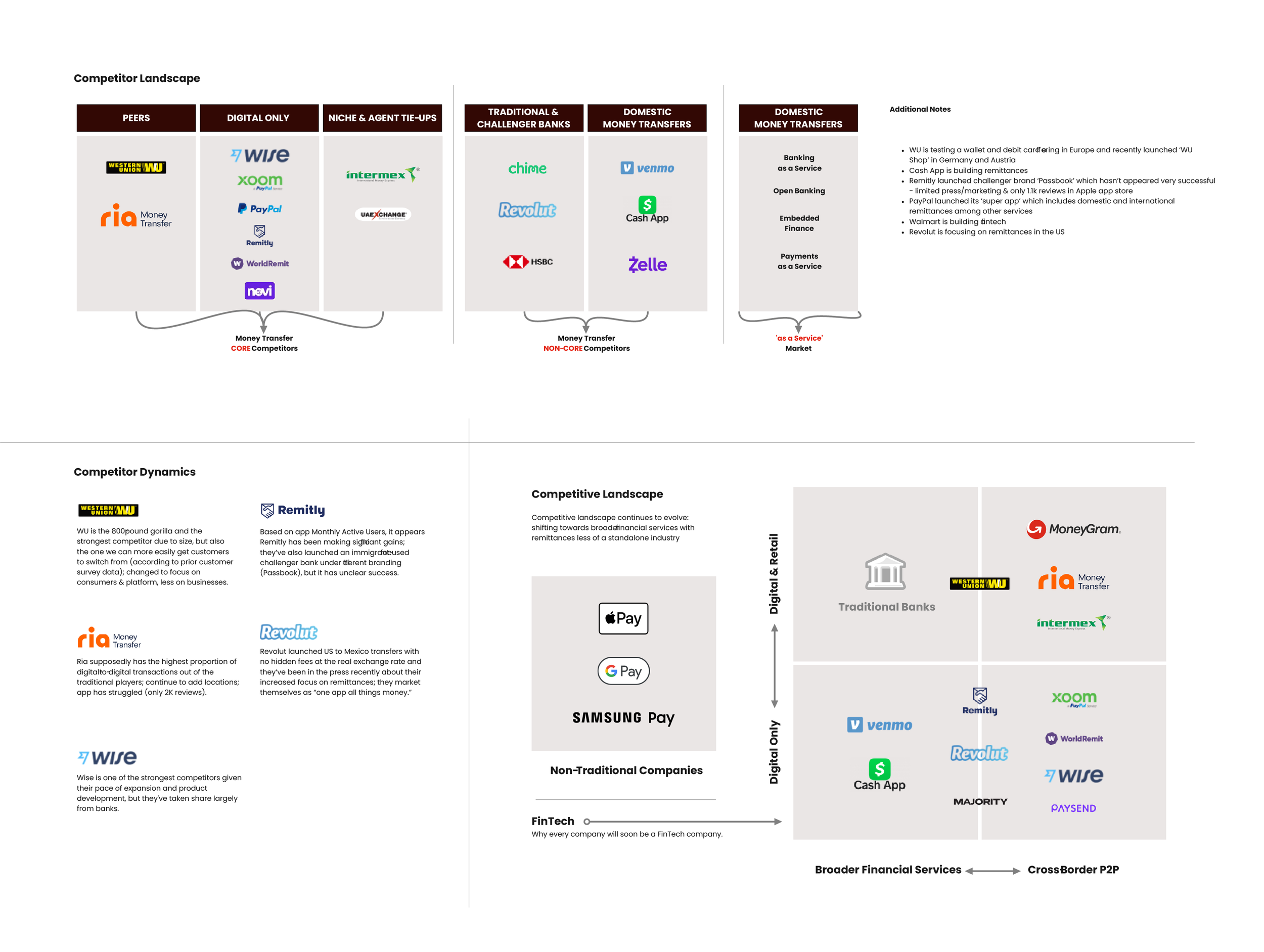
MoneyGram was a utility, not a destination. Our users were essentially paying a "Tax on Tedium" re-entering a 16-digit card number and CVV while standing on buses or in line at a CVS or Walgreens. It was slow, it was expensive, and it lacked future growth.So we dove into researching our competitor landscape to understand the value of Digital & Retail Banking.
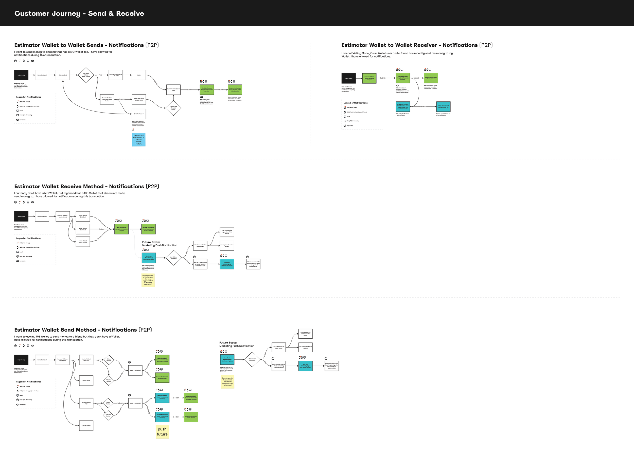
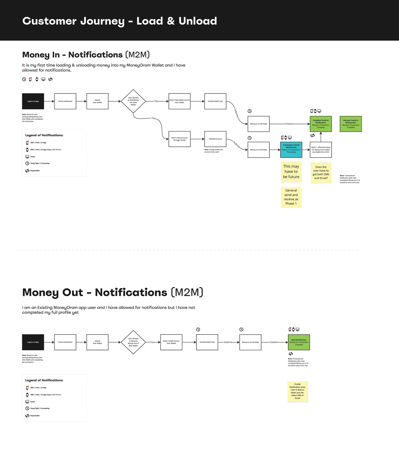
Journey Mapping the Chaos
Before we could fix anything, we had to map out everything. We dug into the current workflows for every user type, mapping out:
Entry points (based on Sender or Receiver)NotificationsMobile, Desktop, and Watch DevicesSupport routes and where users got lost
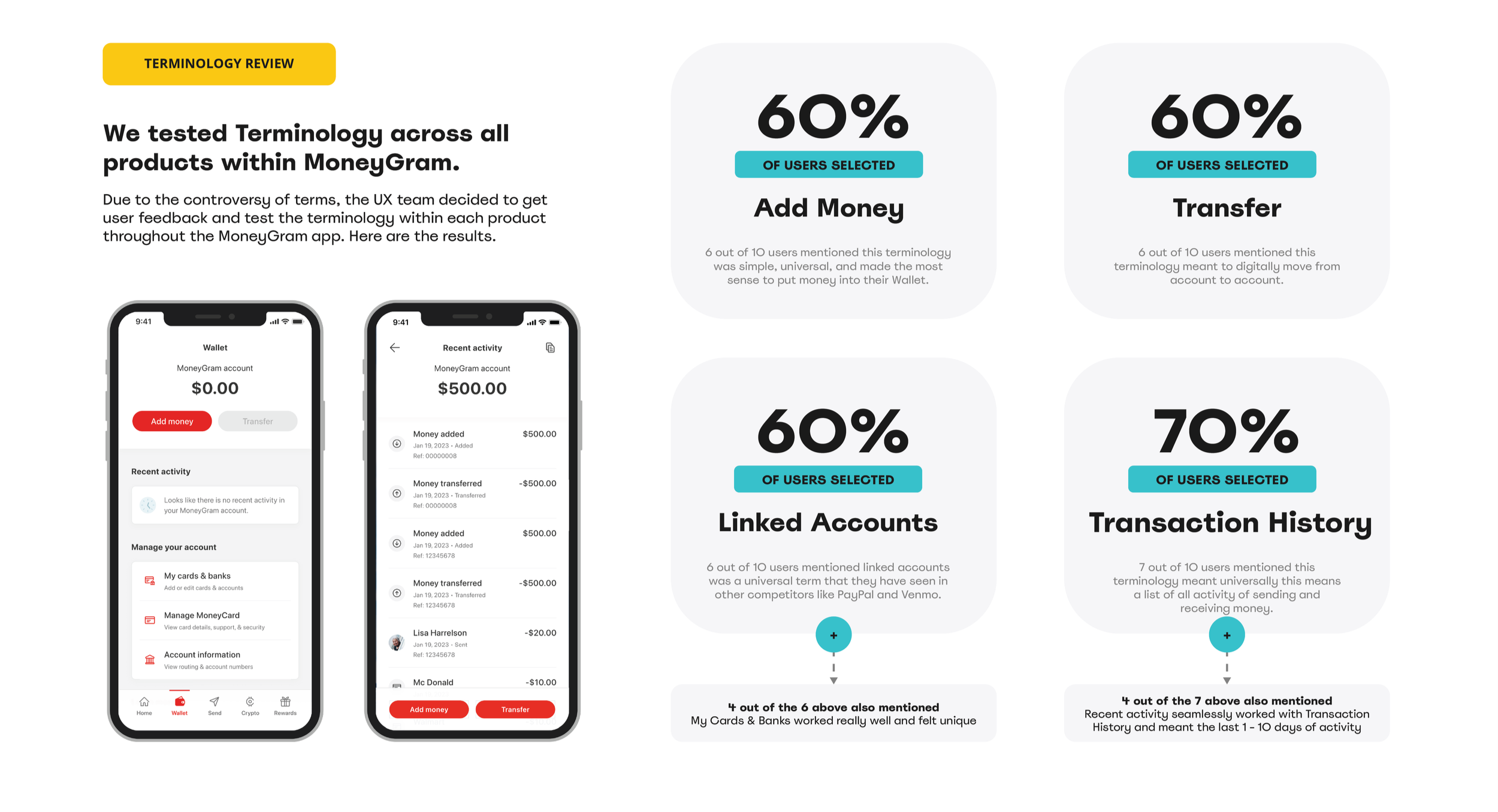
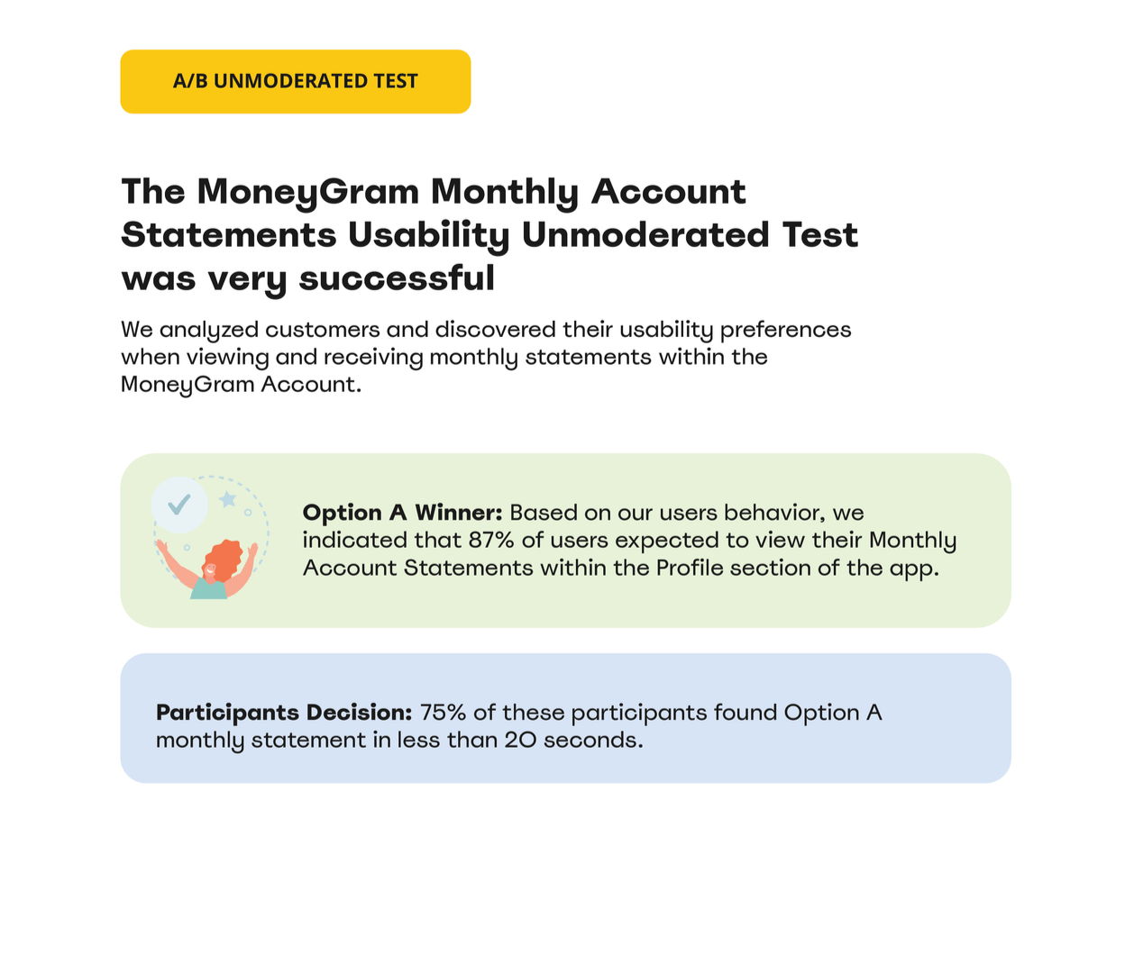
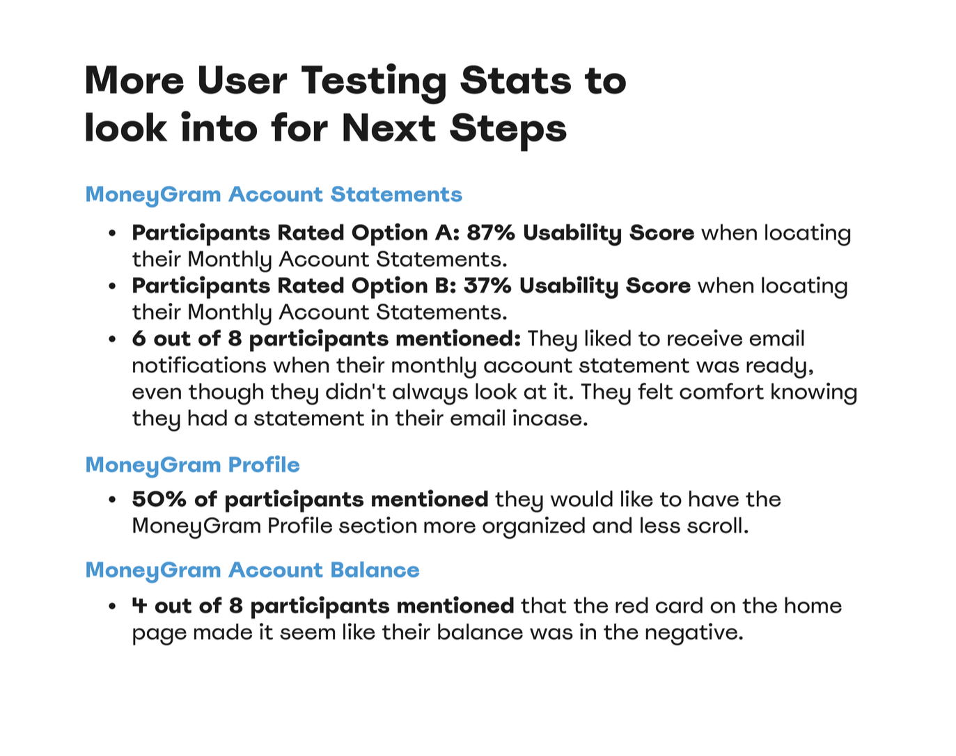
User Testing: Words are hard.
We tested on a global scale, and boy, did we learn things.Words like "Deposit" or "Account" triggered a "this is too complicated for me" response.We focused on "Your Balance." It’s simple, it’s yours, and it’s right there.Users wanted to see their accounts secure and that their money was locked down. But they wanted the doors to open instantly when they hit Send (no matter the time of day).
We tested. And white-boarded. Then tested again. Each round with a focus group of real users. Each round brought us a little closer.
Research, Testing & Real Talk
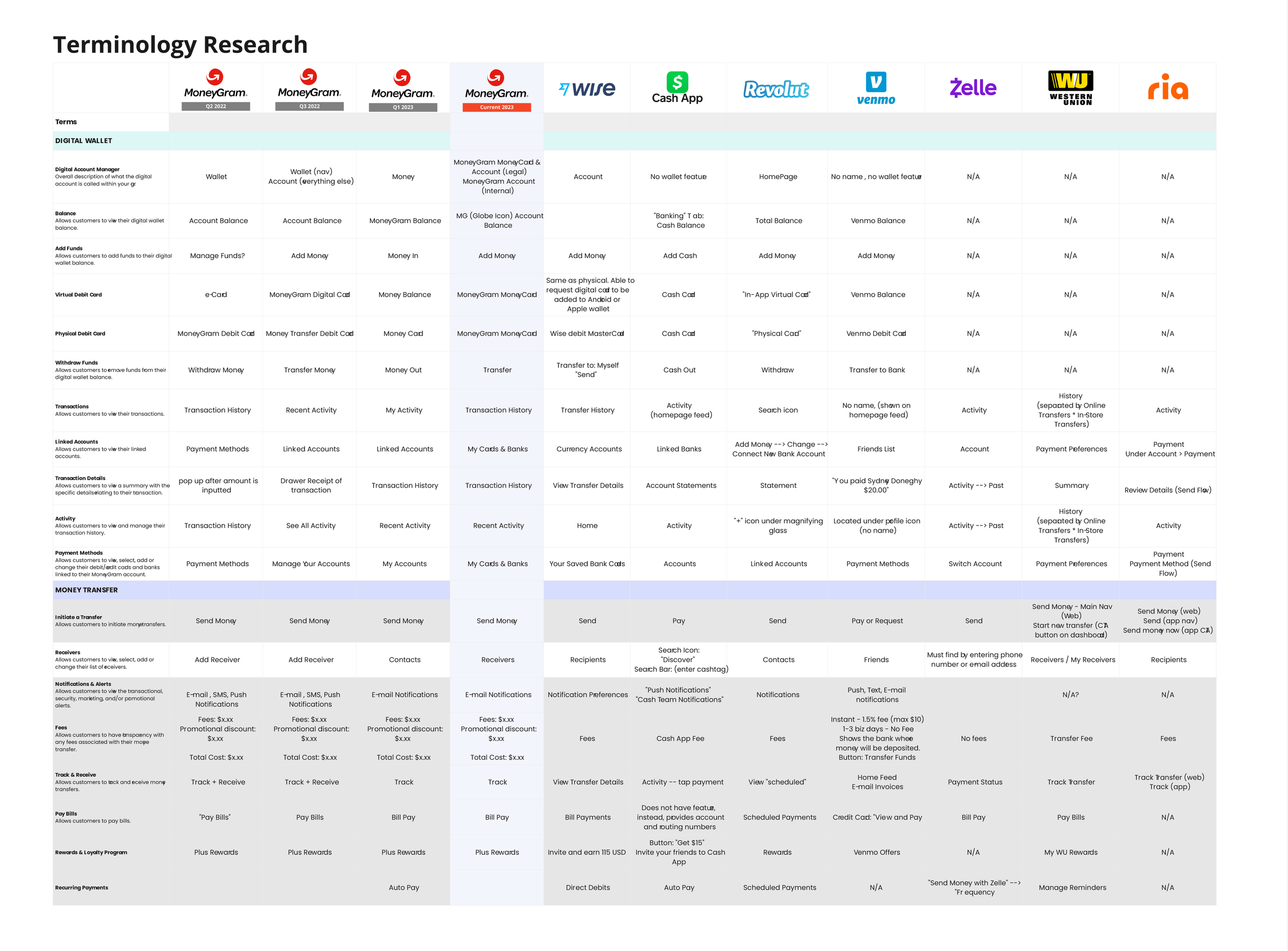
We looked at how competitors in the US and abroad managed their digital wallets. The top competitors didn't try to be Chase or Wells Fargo. They focused on simplicity and terms that didn’t make people feel like a traditional bank.
The Integration: We designed a "One-Tap Funding" system that linked to bank accounts via Plaid-style flows, making it feel like a breeze, not a chore.
The Synchronized Soul: The wallet became the sun at the center of the MG solar system. If you received money, it lived in your wallet. If you wanted to send money, your wallet was the first (and cheapest) option.
The MoneyGram Wallet
We soft-launched the Wallet as a BETA, then a full global release 3 months later on the iOS App Store and Google Play Store:
We hit that sweet spot where Security met Simplicity. By not "looking like a bank" but acting with the integrity of one, we gave users a sense of financial dignity. We took the "struggle" out of the equation and replaced it with a streamlined, synchronized ecosystem.
The result? A product that feels as solid as a vault but as easy to use as a text message. We didn't just modernize a feature; we leveled up the way our users interact with their own future.
"As a repeat user of MoneyGram sending money to family all over the world, the wallet changed the struggle of all the back and forth. It just... works now."